To janvanderzee.com
Got myself a website!
dinsdag 6 oktober 2009
donderdag 7 mei 2009

zondag 3 mei 2009
somethin else
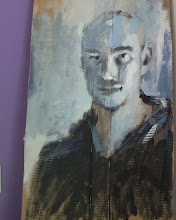
Yesterday I spent some time painting again at a friends workspace/studio. He had a pretty cool picture of Theo van Gogh hanging on one of the walls. It was a black and white picture, so I stayed monochromatic as well. I'm quite happy with the result. I should do this more often.
Cheers!

Cheers!

dinsdag 21 april 2009
'nother scene coloured
Hey,
Still doing bits and pieces here and there. Some scenes need more inbetweens and eventually colour. The colouring does not dissapoint me in terms of time. Per scene, a day or two. Animating and planning takes more time.
The following scene only had a "backbone", no facial expressions and there would be a silhouet sliding along in the forground.
In this scene the boy is in the house, ready to free his pluche friend from the pit he was thrown in. There is something/somebody in the house and the boy does not want to get caught. Glued to the wall he waits to start his rescue-mission, as a shadow slides over him.
woensdag 15 april 2009
New scene
The following scene has undergone a continuity-make over.
The old situation was this:
Following his pluche friend up in the air.
From

To

I was having doubts about the continuity: fast up in the air to slow down immediately. The clip below shows/feels better: fast up, a little more and then slow down.
And I just love these kind of perspectives :)
Thanks for watching!
See ya
woensdag 8 april 2009
Train keeps a rollin
It has been a month already? Don't worry I've been busy. I have uploaded a rough version of the entire animation. Some bits missing, some bits flashing here and there.
Please tell me it's flowing or blowing.
I also have started posting on the conceptart forums, where I got good critisism. I posted this coloured part
Following this part, the characters pluche friend is rocketing into the air in a nice (my opinion) panning shot. Someone mentioned the part being not visually engaging enough which has me reviewing all of the scene's. Just to check i I am able to spot visual un-enaging shots. I must admit that I'm not yet fully trained in this and can't say I can spot them easily. Probably because I'm biased.
That's why it's so good to ask others than yourself. I've been working on this for months and was in need of some fresh eyes on the animated short.
I am in doubt wether or not to shake the whole thing up and make the suggested correction.
Someone suggested to have a point-of-view of the pluche animal, whilst being swayed around. I like that, but that's breaking the whole thing up. Should I do it now or first graduate and then do it? Should I do it at all.. Doubt, doubt, doubt...
Until next time!
maandag 2 maart 2009
woensdag 25 februari 2009
Character sheet and a ruff test
Hi,
Working hard at animating, so took no time to post. Here's an update:
I needed to design the "threat-turning-into-comfort" figure that appears in the storyboard. It's the boy's lovely old neighbour.
Fat and happy, as they need to be :d I had been having trouble finding the right face for her. Some really awful attempts..
Luckily I came in harmony with the style chosen for the boy, so in that length I went on and came up with these:


Ruff test of a flying scene:
Onto my digital pegs, again! See ya!
dinsdag 10 februari 2009
And some more!
Hey,
Been pretty busy with the backgrounds. Here's another bunch of them.
I have a couple of backgrounds left to make, but I'm kinda stuck on them. From the storyboardframes where the toy-boat and pluche are taking off to the skies. I'd like them to be dreamy so maybe I'll try some pastellish stuff. Don't know yet.
The majority of backgrounds are finished so it's time to put them behind eachother and time the animation, trying to act out the scenes. No there won't be any videomaterial available of that. :-)


In the meantime I'm improving my drafting skills so I'm doing figure drawings. Haven't taken the time yet to scan them in, but I will. I'm really determined to get the skills down, cause there's so much room for improvement. Soon a figure drawing course will start in my hometown, which I will be attending. Looking forward to that!
woensdag 4 februari 2009
More backgrounds
Here's two more I created after my last blogdump.


The size of the last one is 3200 pixels wide and 1800 high. I'm using it for a zoom-out shot, as seen in the moving storyboard. In Toon Boom I can make use of the 3d camerasystem and have this image pull back from the lift-off-to-flight-character in the foreground. This image took most of my time, because of the scenery. It has to look like people are living their lives in it, so I kept adding details. I'm letting it go for now, cause I've been starig at it too much!
Time for a different palet now, as we go indoors and slightly creepy. Stay tuned! Oh and dear readers: please kick me in the head with corrections, comments or other useful things!
maandag 2 februari 2009
Lay out
So the story is taking place in a normal Dutch middle class neighbourhood. It's about a little boy, playing and imagining he can fly with his pluche friend. Pluche gets kidnapped by a strange creature and is thrown in a dark pit. The boy tries to save him. The dark pit turns out less imaginative: it's the washing machine and it starts to move. A threathening shadow looms over the boy and he starts to make a run for it. The nearest closet looks like the perfect hideaway, but the evil shadow follows and is getting very close to the little boy. Screeching and scratching noises are shaking him with fear which gives him away to the dark figure. CLICK!! On switches the light! As the hands before his eyes lower to see what this is all about, he is happily surprised to find out that the dark figure is the sweet old babysitter from across the street, holding a jar of candy.
Google Sketchup helps me make the background lay-outs. In photoshop I use a mix of Paths, colours and brushes to create the right mood or picture actually, provided by my storyboard. I'm doing it this way so the shapes and forms stay sharp. Painting sharp like that is not something i'm capable of and I think it has a nice aesthetic. The inspiration for this style comes from everything really, but more notably from the golden gems. I'm trying to create something of my own based on what is done before. I think that you have to respect what is done before and learn from that. First learn, then play with it.
I have already shown the intro-panning-shot. Here are the rest of the backgrounds/layouts i've produced so far.


Now I'm not really happy with the last one.. I'm trying to show more than the storyboard panel suggests and I thought that was for better clarity. I'm not sure anymore. Maybe I'll just crop it like the storyboard. Suggestions?
dinsdag 13 januari 2009
Pan-shot
As of now I've begun animating the scenes. I'm thinking of starting the animation with this panning-shot. Google's SketchUp was used to help me with perspective.


Abonneren op:
Posts (Atom)